Radix-Vue: The Next Generation Component Library for Vue
An introduction to Radix-Vue, a community-led adaptation of Radix UI for Vue that prioritizes accessibility, customization, and developer experience.


Just Released
Radix-Vue: The Next Generation Component Library for Vue
Radix-vue is a community-led adaptation of Radix UI in the Vue ecosystem. It prioritizes accessibility, customization, and developer experience with a variety of unstyled and accessible components. It is inspired by the rise of the headless component libraries that decouple the UI from the component library itself. Let’s explore all the benefits when doing so.
Headless Component Libraries
Everyone shares similar definitions for common UI patterns, such as accordions, checkboxes, dropdowns, sliders, and tooltips. These UI patterns are documented by WAI-ARIA and are generally understood by the community. However, the implementations and the examples provided are either nonexistent, lack functionality, or cannot be customized sufficiently.
As a result, we are forced to build custom components, which is an incredibly difficult task. This means that most components on the web are inaccessible, non-performant, and lack important features.
The goal of a headless component library like Radix is to provide a low-level implementation of all these components and enable a codebase to create a design system by only implementing the styles to match the required designs.
The components of a headless UI library are:
- Unstyled: Everything is shipped with zero styles, giving you complete control over styling.
- Accessible: Components adhere to the WAI-ARIA design patterns.
- Modular: Each component can be installed individually so you can adopt them incrementally.
- Encapsulated: All of the behaviour is handled internally, so you can get up and running as smoothly as possible, without needing to create any local states.
Demo
For demonstrating the library we will use a modal dialog, which is often styled and behave very differently across applications.
Starting with a new project, first, we need to install the library from npm using:
npm install radix-vueThen we need to read the component documentation. The anatomy and the API reference can give us an overview and they are accompanied by many useful examples.
// Anatomy of the modal dialog component
<script setup>
import {
  DialogRoot,
  DialogTrigger,
  DialogContent,
  DialogOverlay,
  DialogClose,
  DialogPortal,
  DialogTitle,
  DialogDescription,
} from "radix-vue";
</script>

<template>
  <DialogRoot>
    <DialogTrigger />
    <DialogPortal>
      <DialogOverlay />
      <DialogContent>
        <DialogTitle />
        <DialogDescription />
        <DialogClose />
      </DialogContent>
    </DialogPortal>
  </DialogRoot>
</template>
Let’s start with a simple example. A dialog with a title and description.
<script setup>
import { ref } from "vue";
import {
  DialogRoot,
  DialogTrigger,
  DialogContent,
  DialogOverlay,
  DialogPortal,
  DialogTitle,
  DialogDescription,
  DialogClose,
} from "radix-vue";

const open = ref(false);
</script>

<template>
  <DialogRoot v-model:open="open">
    <DialogTrigger>Open</DialogTrigger>
    <DialogPortal>
      <DialogOverlay />
      <DialogContent>
        <DialogTitle>Title</DialogTitle>
        <DialogDescription>Description</DialogDescription>
        <DialogClose>Close</DialogClose>
      </DialogContent>
    </DialogPortal>
  </DialogRoot>
</template>
Will produce the following
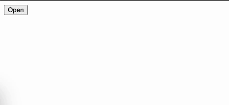
OK, the result is anticlimactic but as advertised the styling is not a concern of a headless UI library. It is up to us to provide them according to our style guide.
As a reference, we will use the following design.
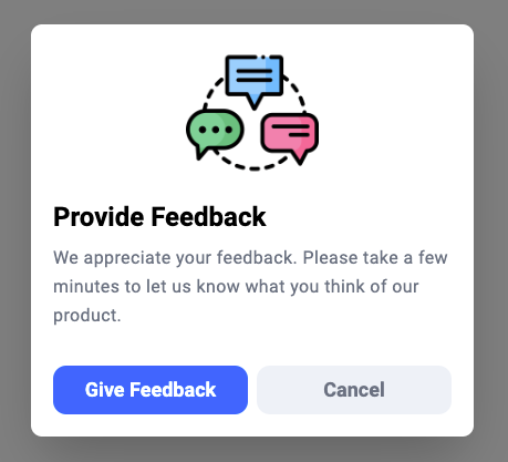
In order to style it we will add classes and target them with some basic CSS.
<script setup>
import { ref } from "vue";
import {
  DialogRoot,
  DialogTrigger,
  DialogContent,
  DialogOverlay,
  DialogPortal,
  DialogTitle,
  DialogDescription,
  DialogClose,
} from "radix-vue";

const open = ref(false);
</script>

<template>
  <DialogRoot v-model:open="open">
    <DialogTrigger class="dialog-trigger">Open Modal Dialog</DialogTrigger>
    <DialogPortal>
      <DialogOverlay class="dialog-overlay" />
      <DialogContent class="dialog-content">
        <img class="dialog-image" src="./assets/feedback.png"  alt="Feedback"/>
        <DialogTitle class="dialog-title">Provide Feedback</DialogTitle>
        <DialogDescription class="dialog-description">
          We appreciate your feedback. Please take a few minutes to let us know
          what you think of our product.
        </DialogDescription>
        <div class="button-group">
          <DialogClose class="cta">Give Feedback</DialogClose>
          <DialogClose>Cancel</DialogClose>
        </div>
      </DialogContent>
    </DialogPortal>
  </DialogRoot>
</template>

<style scoped>
.dialog-trigger {
  margin: 100px auto;
}

.dialog-overlay {
  position: fixed;
  top: 0;
  left: 0;
  right: 0;
  bottom: 0;
  background: rgba(0, 0, 0, 0.5);
}

.dialog-content {
  position: fixed;
  top: 50%;
  left: 50%;
  transform: translate(-50%, -50%);
  background: #ffffff;
  box-shadow: 0 25px 50px -12px rgba(0, 0, 0, 0.25);
  border-radius: 10px;
  padding: 20px;
  max-width: 400px;
}

.dialog-image {
  display: block;
  width: 120px;
  margin: 0 auto 20px;
}

.dialog-title {
  font-size: 22px;
  font-weight: 600;
  margin: 0 0 10px;
}

.dialog-description {
  color: rgb(107, 114, 128);
  letter-spacing: 0.4px;
  line-height: 1.6;
  margin: 0;
}
</style>
Tip: A library like Tailwind can be utilised at this stage to minimize written styles.
We managed with little effort to implement a fully functional and keyboard-accessible modal. You can check it out here.
The only problem is that our component is not reusable. If we were to create another modal we would have to duplicate all the styles. And code repetition is a sin in software development. In order to avoid this we will create a wrapper (shell) component that will host all of the common styles and functionality and will ensure that all of our modals look and behave the same.
Reusable Modal Component
The goal of the reusable modal dialog component is to serve as a bridge between our application and Radix-vue and narrow down all the possible options and configurations.
To do this we will replace the component-specific parts with named slots.
_@/components/common/AppModal.vue_
<script setup>
import { ref } from "vue";
import {
  DialogRoot,
  DialogTrigger,
  DialogContent,
  DialogOverlay,
  DialogPortal,
  DialogTitle,
  DialogDescription,
  DialogClose,
} from "radix-vue";

const open = ref(true);
</script>

<template>
  <DialogRoot v-model:open="open">
    <DialogTrigger class="dialog-trigger">
      <slot name="trigger" />
    </DialogTrigger>
    <DialogPortal>
      <DialogOverlay class="dialog-overlay" />
      <DialogContent class="dialog-content">
        <div class="dialog-image">
          <slot name="image" />
        </div>
        <DialogTitle class="dialog-title">
          <slot name="title" />
        </DialogTitle>
        <DialogDescription class="dialog-description">
          <slot name="description" />
        </DialogDescription>
        <div class="button-group">
          <div class="cta">
            <slot name="cta" />
          </div>
          <DialogClose>Cancel</DialogClose>
        </div>
      </DialogContent>
    </DialogPortal>
  </DialogRoot>
</template>

<style scoped>
.dialog-trigger {
  margin: 100px auto;
}

.dialog-overlay {
  position: fixed;
  top: 0;
  left: 0;
  right: 0;
  bottom: 0;
  background: rgba(0, 0, 0, 0.5);
}

.dialog-content {
  position: fixed;
  top: 50%;
  left: 50%;
  transform: translate(-50%, -50%);
  background: #ffffff;
  box-shadow: 0 25px 50px -12px rgba(0, 0, 0, 0.25);
  border-radius: 10px;
  padding: 20px;
  max-width: 400px;
}

.dialog-image :deep(img) {
  display: block;
  width: 120px;
  margin: 0 auto 20px;
}

.dialog-title {
  font-size: 22px;
  font-weight: 600;
  margin: 0 0 10px;
}

.dialog-description {
  color: rgb(107, 114, 128);
  letter-spacing: 0.4px;
  line-height: 1.6;
  margin: 0;
}
</style>
In our application, we just have to fill the required slots and implement any required logic.
_@/components/FeedbackModal.vue_
<script setup>
import AppModal from "./common/AppModal.vue";

function handleFeedback() {
  // TODO: Handle feedback modal specific logic
}
</script>

<template>
  <AppModal>
    <template #trigger>Open Dialog Modal</template>
    <template #image>
      <img src="./../assets/feedback.png" alt="Feedback" />
    </template>
    <template #title>Provide Feedback</template>
    <template #description>
      We appreciate your feedback. Please take a few minutes to let us know what
      you think of our product.
    </template>
    <template #cta>
      <button @click="handleFeedback">Give Feedback</button>
    </template>
  </AppModal>
</template>
Additionally adding modifiers like modal size, close button etc can now be implemented inside the AppModal and be controlled by props.
<script setup>
...
defineProps({
  size: {
    type: string,
    default: "md",
  },
  hasCloseButton: {
    type: boolean,
  },
});
...
</script>

<template>
  ...
  <DialogClose v-if="hasCloseButton" />
  ...
</template>

<style scoped>
...
.dialog-content.sm {
    max-width: 300px;
}

.dialog-content.md {
    max-width: 400px;
}

.dialog-content.lg {
    max-width: 500px;
}
...
</style><AppModal size="sm" has-close-button> ... </AppModal>Conclusion
Headless UI libraries are getting a lot of traction because they offer a number of advantages over traditional UI libraries. They give us complete control over the look and feel of our application, are often more lightweight and accessible, can be reused across multiple projects, and are easier to maintain.
On an enterprise codebase where following the company brand is crucial, they can power a full fledge design system. The built-in accessibility comes for free and can have a big impact on popular applications.
It’s refreshing to see the UI component library landscape in the Vue ecosystem looking promising for a change. 🚀

Keep reading


![[Vue 3] Why both Ref and Reactive are needed](/_astro/img-1.Dm6ZyWyJ_5ALc3.webp)